LinkedIn Background Image Dimensions: 2026 Guide

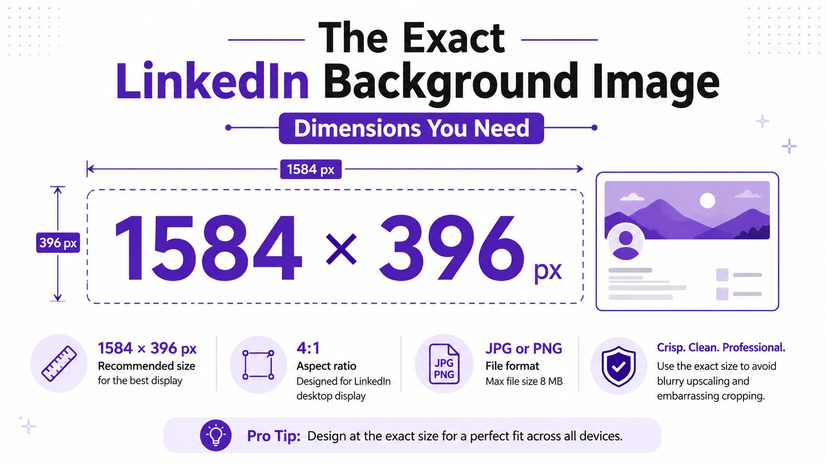
The LinkedIn personal background image should be 1584 × 396 pixels, which is a 4:1 ratio, and it should be uploaded as JPG or PNG under 8 MB. That exact spec is what keeps the banner from turning into blurry mush or getting chopped in all the wrong places on desktop and mobile.
You've probably seen the same mistake a hundred times. A seller grabs a nice-looking hero image, uploads it, and wonders why their “premium brand” suddenly looks like it was stretched through a cheap office printer.
Table of Contents
The Exact LinkedIn Background Image Dimensions You Need
The number you want is 1584 × 396 pixels, which works out to an exact 4:1 aspect ratio. For the personal profile banner, that's the spec to build around, and the file should be JPG or PNG, with a maximum size of 8 MB. That combination is the sweet spot for keeping the banner sharp instead of upscaled and fuzzy, and for avoiding awkward cropping when LinkedIn compresses the image for different screens. Canva's LinkedIn size guide and Hyperclapper's 2026 background cover guide both converge on the same profile-banner dimensions.
What goes wrong when you ignore the spec
The classic mistake is uploading a random widescreen image because it “looks fine on my laptop.” Then LinkedIn squeezes it into a banner slot that was never meant to hold extra height, and the result is soft edges, chopped copy, or a logo hovering in dead space like it got lost on the way to the party.
That's why the help-page language often feels less direct than practitioners want. LinkedIn's image references and third-party guides keep returning to the same banner spec, which tells you this isn't design folklore, it's a fixed presentation rule. LinkedIn's own help documentation for page images reinforces that cover assets are standardized, not freestyle.
Practical rule: if your source file isn't built for a 4:1 layout, you're not “optimizing later.” You're gambling with the first branded surface a buyer sees.
A common offender is a hero image sized like a website header, then shoved into the profile banner slot. It may upload, but it won't land cleanly, and that's enough to make a visitor assume the rest of the profile was assembled the same way.
Why the 4:1 Aspect Ratio Is Not Optional
A LinkedIn banner that misses the frame usually fails in the same place, the buyer's first glance. On desktop it may look merely awkward, but on mobile the crop gets harsher fast, and that is where profile visitors decide whether to keep scrolling or click into your page. If your banner text, logo, or product shot sits too close to the edges, the platform will trim it, and the trim is usually what people notice first.
The reason is simple. 1584 ÷ 396 = 4, which gives you the 4:1 aspect ratio LinkedIn expects for a personal profile background. Treating the banner like a flexible canvas is how teams end up with chopped copy, soft scaling, or a visual that looks fine in a design file and broken in the live profile. LinkedIn does not reinterpret the layout for you, it fits the image into a fixed slot and the slot sets the terms.
A 1920 × 480 hero image sounds close enough, until you look at what happens in the crop. The extra pixels still need to be forced into a profile header that is built for a specific shape, so the image gets resized in a way that can flatten detail or push important content out of view. A square 1080 × 1080 crop is even less forgiving, because the banner has to throw away most of the vertical structure to make it work as a horizontal header.
Sanity-check any file in ten seconds
A quick check saves a lot of cleanup later. If the width is not four times the height, the file is already fighting the banner slot before it ever uploads.
A 1366 × 768 stock image is the kind of file that fools people in review. It looks wide enough in a folder preview, but LinkedIn still has to squeeze it into a much shallower header, which means any copy near the corners, or any face placed too high or too low, is exposed to the crop. That is the trade-off sellers ignore at their own risk, and it shows up fast when the banner is the first thing a buyer sees. A sharp profile can still feel unprepared if the header is the part that gets clipped.
If the banner also needs to support reputation work, the layout gets even less forgiving. Strong profiles and clean company surfaces depend on the same discipline, which is why practical guides on online reputation management strategies usually start with consistency before creative flair.
Keep text out of the outer edges unless you enjoy watching headlines vanish for mobile users.
The banner is a controlled frame. If your design does not respect the frame, the frame wins.
Comparing Banner Specs Across LinkedIn Surfaces
A personal profile banner is not the same animal as a company page cover or a Life tab image. LinkedIn deliberately uses different canvases for different surfaces, which means one master file won't behave properly everywhere. If you're a B2B marketer or a seller who also manages a company page, sloppy reuse starts creating weird distortion and dead-on-arrival visuals.
Surface | Pixel Dimensions | Aspect Ratio | Typical Use |
|---|---|---|---|
Personal profile background | 1584 × 396 | 4:1 | Individual profile header |
Company page cover | 4200 × 700 | Wide cover format | Brand, headquarters, services, or slogan |
Life tab main image | 1128 × 376 | Narrow wide format | Employer brand, culture, and talent content |
That comparison matters because a seller and a company page need separate master files. The personal banner is built for a profile visitor deciding whether you're worth a click, while company-page assets are tuned for organizational branding, recruiting, and broader page presentation.
LinkedIn's official help page for company and career-page images shows just how different those surfaces are, with dimensions such as 4200 × 700 for a page cover image and 1128 × 376 for the Life tab main image. In other words, LinkedIn isn't lazy with sizing, it's precise about context. LinkedIn's image specifications for pages and career pages make that clear.
If you manage reputation across multiple LinkedIn assets, the same logic applies to the rest of the profile ecosystem too. This reputation-management overview is a useful reminder that the visual surface is part of the trust surface.
Uploading and Replacing Your Banner in LinkedIn Settings
On desktop, the clean path is simple. Open Me, choose View Profile, click Edit intro, then use the pencil icon on the banner area or the Edit profile flow if LinkedIn shows that version of the interface. From there, upload the file, crop if needed, and save. The mobile app uses a different layout, so a seller working from their phone may see an edit path buried inside the profile card rather than the desktop-style header controls.
Quick fixes when LinkedIn behaves badly
If the upload stalls, the most common culprits are boring ones. The file type may be wrong, the file may be over 8 MB, or the browser cache may be holding onto an old preview.
Wrong format: re-export as JPG or PNG, then upload again.
File too large: compress the image and keep it under 8 MB.
Stale browser state: clear cache, refresh, and try a private window if needed.
The point is speed, not ceremony. Most upload failures are fixed faster than it takes to write a support ticket.
If you're editing on mobile, expect the interface to hide a few controls that desktop users see immediately. That's not a content problem, it's just LinkedIn being LinkedIn, which is why it helps to know both flows before you're stuck staring at a spinner during lunch.
Designing Inside the Mobile Safe Zone
Mobile is where banners get judged harshly. The circular profile photo overlaps the bottom-left portion of the banner, and smaller screens crop the image more aggressively than most desktop users realize. That means the mobile safe zone is the area that still reads cleanly even when the left edge is partly covered and the top and outer sides are trimmed.

Where the useful content actually lives
Think of the safe zone as the center-right portion of the banner, not the corners. Logos, short value statements, and any call to action should sit where they'll survive both the profile-photo overlap and the mobile crop.
Text in the far left corner often disappears on iPhone-class screens. Text in the top edge can also get shaved off, which is why stuffing your best line into a corner is a reliable way to make sure nobody reads it.
That's the conversion angle people miss. A banner that communicates nothing on mobile wastes the visitor's first few seconds, and those seconds are exactly when a prospect decides whether your profile is worth a click.
Put the hook where the thumb can still see it, not where the desktop mockup looked pretty.
The safest visual pattern is simple, an outcome headline on the right, supporting visual on the left, and nothing important trapped behind the profile photo. That layout gives you the best shot at readability without fighting the interface.
File Type, File Size, and Compression Choices
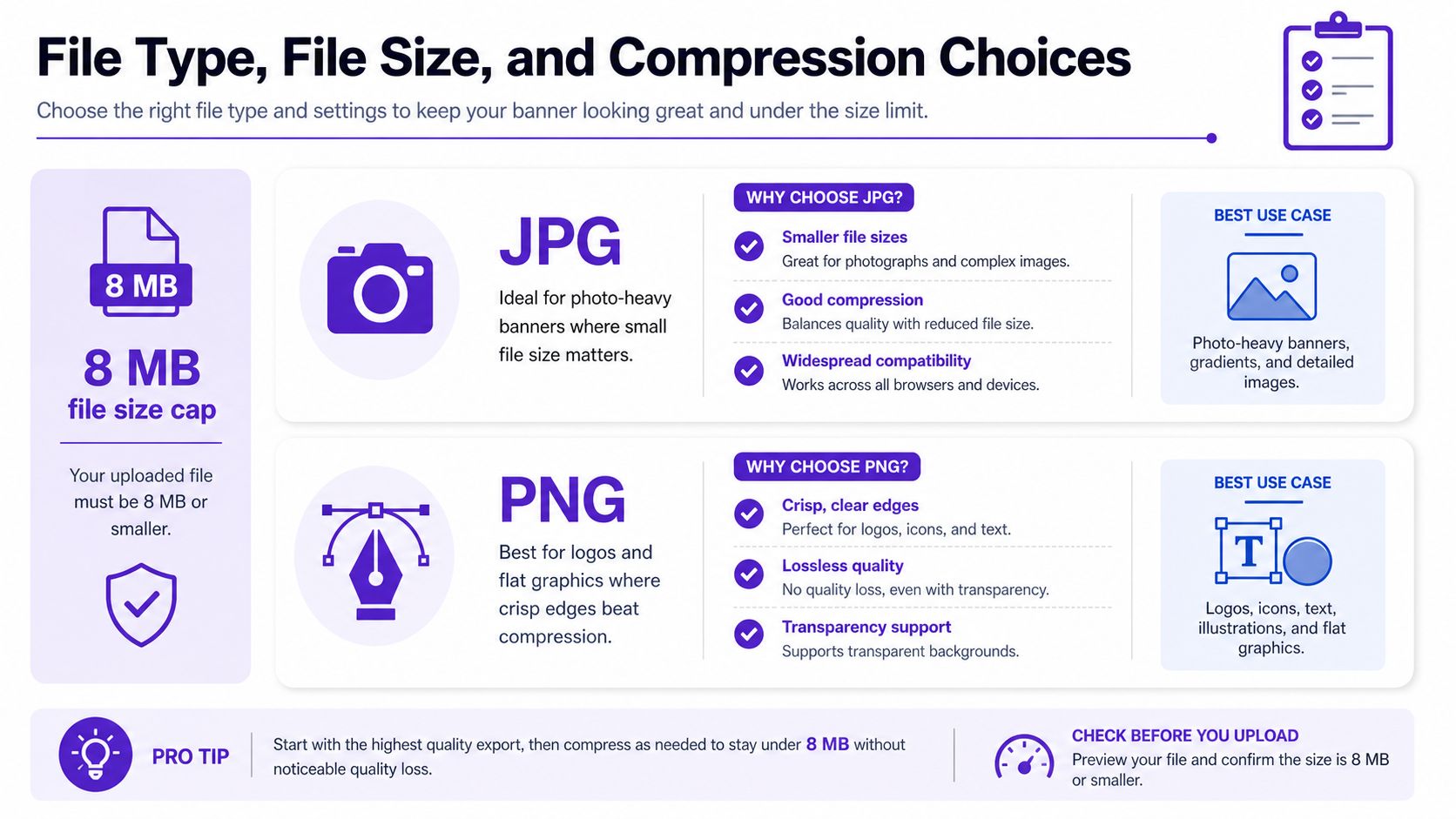
For most banners, JPG is the practical choice when the image is photo-heavy and you want the file to stay lean. PNG is better when the design relies on logos, flat shapes, or crisp typography that compression would smear. LinkedIn also accepts GIF for background images, which is useful when motion is serving the message instead of just showing off.
How to stay under the cap without wrecking quality
The file limit for personal background images is 8 MB, so the game is to export cleanly before LinkedIn does its own compression pass. In tools like Canva, Figma, or Photoshop, the practical move is to export at the correct banner dimensions, choose a web-friendly quality setting, and avoid oversized source art that forces needless compression.
The same upload discipline helps with the profile photo slot too. LinkedIn's 2026 guidance notes a 400 × 400 px minimum for profile photos and accepts images up to 7680 × 4320 px, again with an 8 MB cap. That matters because if the avatar is sloppy, the banner has to do more work than it should.
A quick checklist keeps things sane:
Use JPG for complex photos when file size is the bigger concern.
Use PNG for logos and clean text when edge clarity matters most.
Keep the exported banner under 8 MB before upload.
Review the avatar at the same time so the header and profile photo don't clash visually.
If you're building a reusable workflow, that's the kind of setup that saves headaches later. It's also where tools that help extend or generate LinkedIn banners, including RoverLead AI's banner-related features, can fit into a broader production process without turning every refresh into a design project.
Turning the Banner Into a Conversion Asset
A seller's LinkedIn banner sits in the click path. After the profile photo, it is the next visual cue a visitor uses to decide whether the profile is worth a closer look. If the banner is vague, the buyer has to do extra work, and that usually means the click dies in place.
I see a common mistake here. Teams spend the banner budget on brand polish, then leave the message too generic for a buyer who is scanning for relevance in a few seconds. The header looks tidy, but it does not answer the quiet question that matters: “Does this profile match what I need right now?”
A simple layout that earns attention
The most reliable layout is plain and practical. Put the outcome headline on the right, keep the supporting visual on the left, and leave the bottom-left overlap area clear of anything that cannot be covered.
That layout fits the way LinkedIn crops the banner and the way people scan a profile. The header should support the profile headline and buyer promise, not repeat a logo the visitor already saw in the photo slot.
For outbound teams, the banner should reinforce the same message discipline used in LinkedIn auto-message workflows. When the banner, headline, and first message all point at the same offer, the profile reads like one deliberate path instead of three separate assets stitched together.
The banner's job is to make the click feel safe.
That is a conversion job. Once the header is treated as part of the decision path, the design choices get much easier, and a lot less decorative.
Common Upload Problems and Quick Fixes
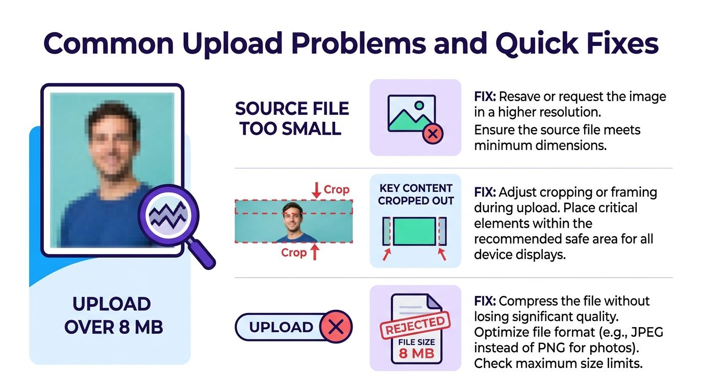
Blurry banners usually come from source files that were too small to begin with. The fix is obvious, re-export at 1584 × 396 so LinkedIn isn't forced to upscale a tiny image into a wide header that should look crisp.
Fast diagnosis for the usual headaches
If key content is cropped out, the problem is placement, not the platform. Move the text or logo into the safe zone and keep anything important away from the outer edges and bottom-left overlap.
If LinkedIn rejects the file, the size is often the culprit even when the image looks fine elsewhere. Compress it below 8 MB and try again.
If you get an “image failed to upload” style message, clear the browser cache, refresh the page, and repeat the upload in a private window. That usually solves the silent failure without needing a support rabbit hole.
The pattern is simple. If the banner looks wrong, the cause is usually source size, crop placement, or file weight, and each one has a one-step fix you can run before you waste half an hour fiddling with settings.
Treating the Banner as a Living System, Not a One-Time Design
A good banner shouldn't sit untouched for two years like a framed certificate from a conference nobody remembers. Sellers and GTM teams can use the profile header to test new positioning, new ICP language, or a fresh offer without building a whole new page.
The smart cadence is a periodic refresh tied to changes in offer or audience focus. If your pitch changes, the banner should change with it, because the people landing on your profile are usually there for a reason, not by accident.
Why the rotating banner matters
Rotating the message gives you a low-friction way to see what earns more curiosity. You're not running a giant experiment, you're letting the profile reflect the current market conversation and watching whether the right people keep moving deeper into the profile.
That's especially relevant if your outreach strategy leans on social selling. RoverLead's social selling perspective fits neatly here, because the profile banner can reinforce the same ICP and intent signals your outreach is already targeting.
Treat the banner like a living system and it starts paying rent. Leave it static and it slowly becomes background noise, which is a weird thing for a background image to do, but LinkedIn manages it when people stop updating.
Quick Answers on LinkedIn Background Image Dimensions
Yes, LinkedIn can accept GIF banners, but the same 8 MB cap still matters. If the motion doesn't improve comprehension, a static file is usually the cleaner choice.
If you're wondering how often to refresh the banner, the answer is tied to business changes, not a calendar ritual for its own sake. Update it when your offer, audience, or positioning changes enough that the old message feels stale.
No, company page banners do not follow the same spec as personal profiles, which is why the comparison table above exists. A one-size-fits-all banner usually looks wrong on at least one surface, often both.
If LinkedIn preview shows a different crop than the uploaded file, trust the safe zone, not the preview mood swings. Re-export the design with more breathing room in the center, because that's the part most likely to survive the platform's display behavior.
For deeper prospecting context, LinkedIn lead generation tactics work best when the profile itself is clean, current, and visually legible. A good banner won't close deals by itself, but a bad one absolutely can make a buyer leave before the conversation starts.
If you want the banner to do more than look tidy, RoverLead AI can help connect your profile visuals to the rest of your LinkedIn prospecting system. It's built to turn LinkedIn engagement into high-intent leads, and its AI banner tooling can help you create or adapt profile visuals that fit the right dimensions without turning every refresh into a design scramble. Visit RoverLead AI if you want your profile to work harder before the first message even lands.