
Forecast Accuracy Improvement: Your 2026 Playbook

Monday morning, the forecast sounded crisp. Friday afternoon, half the region had slipped, two large deals had gone dark, and the CRO was staring at the one question nobody likes in a QBR, “What changed?” That's the part many teams know too well. The forecast looked fine on the slide, but the business still had to live with the miss.
That gap between a polished call and an ugly actual is why forecast accuracy improvement matters. It's not a reporting exercise, and it's definitely not a vanity metric for ops decks. Accuracy work changes hiring plans, inventory posture, cash planning, and how much trust the board gives the next number you put in front of them. Weather forecasters learned this the hard way, too. A 48-hour forecast that once had an average track error of about 200 to 400 nautical miles in the 1970s is around 50 nautical miles today, and 3-day forecast accuracy is now around 97% according to Our World in Data's weather forecast history.
The same logic applies in revenue. A 15% increase in forecast accuracy can boost pre-tax profit by 3% or more, and a 10% to 20% improvement in demand forecast accuracy can reduce inventory costs by about 5%, according to a supply-chain analysis citing the Institute of Business Forecasting and McKinsey at this supply-chain write-up. In other words, small gains are not small when they compound across service levels, working capital, and confidence.
Table of Contents
The Forecast Call That Was Off by 40%
The call was made with the kind of confidence that usually comes from a clean pipeline review and a few too many green slides. The region looked stable, the top deals were “committed,” and the weekly number had already been socialized upward. By Friday, the large opportunity in the southeast had slipped, a second deal had stalled behind procurement, and the gap wasn't a rounding error anymore. It was the kind of miss that makes finance teams stop asking for explanations and start asking for process.
That's what forecast misses really do. They don't just embarrass the rep who overpromised, they ripple into headcount decisions, supply commitments, and how much slack the CFO builds into next quarter's plan. One bad call can force the whole business to act as if uncertainty is normal when it didn't need to be. That's why forecast work belongs next to capital allocation, not tucked into a CRM dashboard nobody trusts.
Why the business feels the miss fast
In a healthy process, the forecast is a live operating signal. In a broken one, it's a polished narrative with a lagging apology attached. The difference matters because the cost of being wrong isn't evenly distributed. A revenue miss can delay hiring, a demand miss can create stockouts or excess inventory, and a board miss can subtly lower confidence in every number that follows.
Practical rule: if a forecast only gets reviewed at quarter end, it's already a post-mortem, not a management tool.
The right mindset shift is simple, even if the execution isn't. Accuracy improvement isn't a single model swap or a heroic cleanup sprint. It's a system of small, compounding fixes, cleaner inputs, sharper signals, and more disciplined reviews. Weather forecasting didn't get better because someone found one magic algorithm. It got better because the whole system got better, and the same is true here.
A useful way to keep that discipline visible is to connect forecasting to the broader revenue story, not just the number in isolation. If you're also thinking about how revenue gets assigned and explained, the logic behind revenue attribution models is a helpful companion read. Forecasts tell you what you think will happen, attribution helps explain what transpired, and those two conversations should never be mixed up.
Measuring Accuracy the Way Finance Measures It
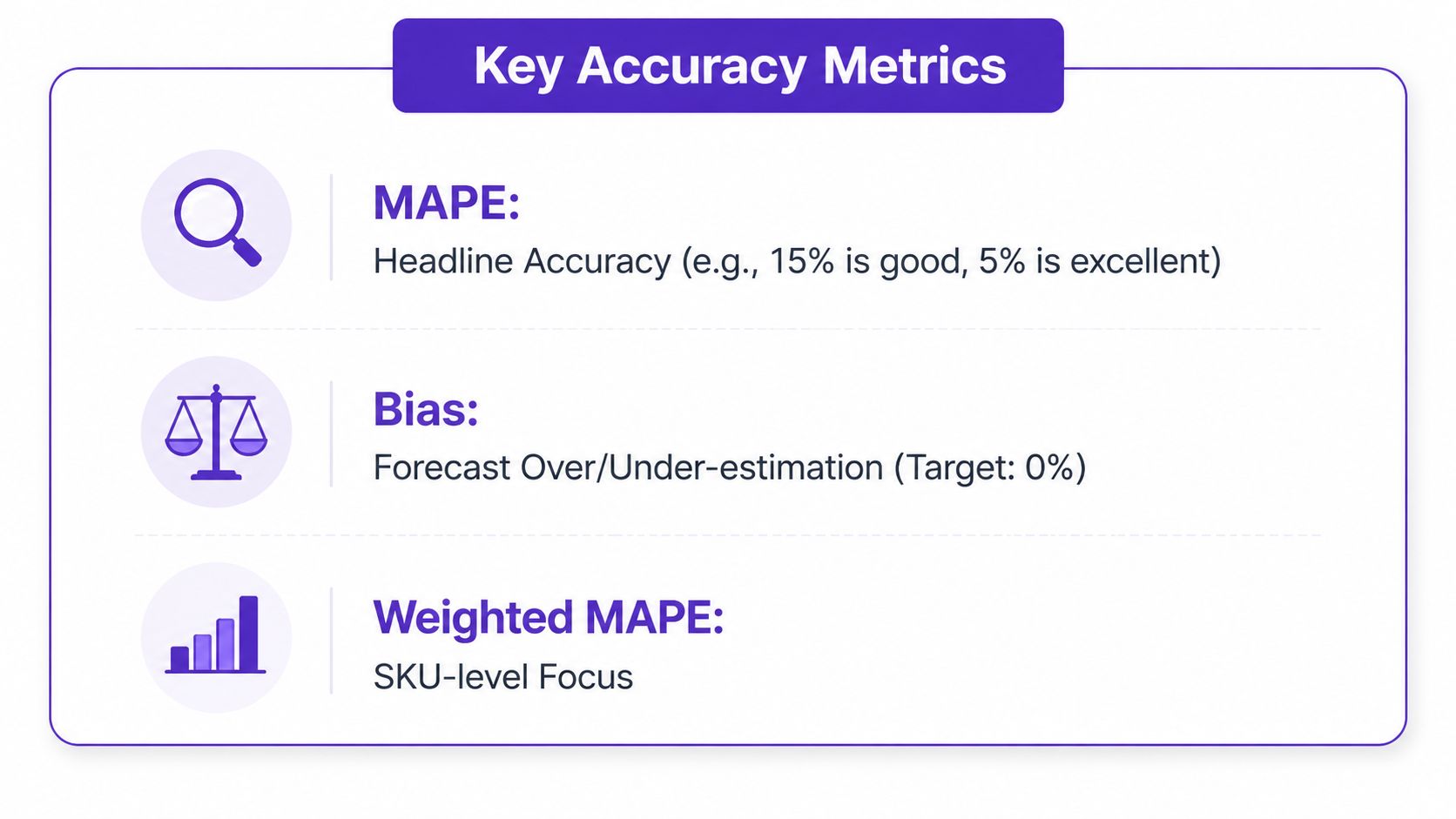
Before you fix a forecast, you need a number you can defend. The cleanest headline metric is MAPE, or mean absolute percentage error, because it tells you, in plain terms, how far the forecast was from reality in percentage terms. But MAPE alone is a bit like checking one gear in a transmission and calling the whole car roadworthy. You also need bias, which shows whether you're consistently high or low, and forecast value added, which helps separate the model's contribution from human overrides.
For a simple five-week example, imagine forecasts of 100, 110, 105, 120, and 115 against actuals of 95, 100, 110, 118, and 108. You'd calculate the absolute error each week, turn each into a percentage of actuals, and average them for MAPE. Bias uses the signed difference, so it shows direction, not just size. FVA compares the accuracy of the baseline forecast with the adjusted version, so you can tell whether the spreadsheet wizardry helped.
What each metric tells you
MAPE: the headline readout. It's the quickest way to see whether accuracy is moving in the right direction.
Bias: the drift detector. If the forecast keeps landing above or below actuals, bias will tell you that.
FVA: the sanity check. It answers whether human changes improved the baseline or just made the forecast feel more comfortable.
The trap is optimizing for one number at the company level while hiding messier behavior underneath. A blended total can look acceptable even when one product line or one planner is consistently off. That's why a finance-grade measurement stack needs one primary metric, one diagnostic metric, and one process metric, reviewed on a cadence people consistently honor.
For teams that already track revenue performance, it also helps to keep the metric family consistent with how the business evaluates pipeline and conversion. If you're aligning forecast language with CRM discipline, the thinking in CRM data enrichment is relevant because the forecast is only as reliable as the records behind it.
Diagnosing Where the Error Actually Lives
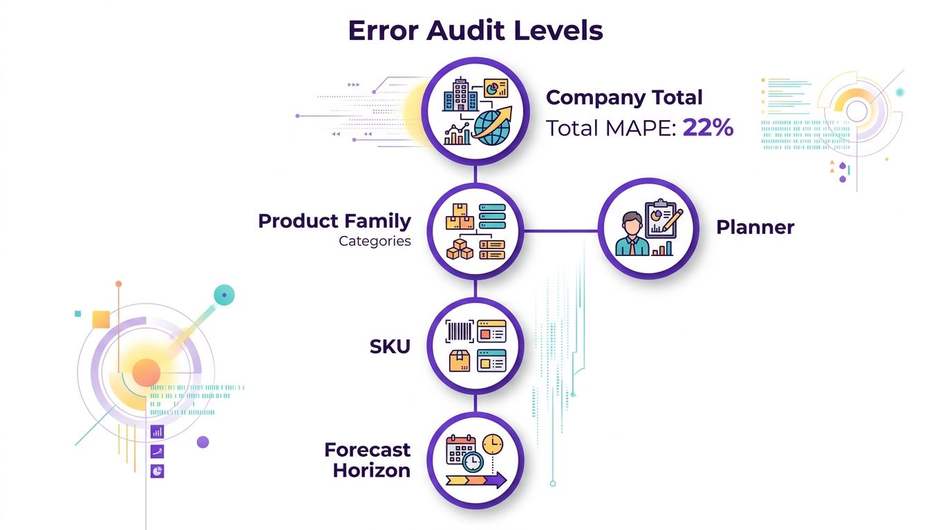
A good headline number can hide a bad business. That's why the first audit should break error out by company total, product family, SKU, forecast horizon, and planner. The total may look respectable while one product line is way off or one planner is consistently optimistic. If you can't name your three worst segments by horizon and planner, you don't have a baseline yet, you have a vibe.
The cuts that belong on the review slide
Start with the total MAPE, then add the next layer down. Product families usually expose mix problems, SKUs expose operational noise, horizons expose timing error, and planner-level cuts show coaching gaps. That mix matters because a process that looks good on a quarterly aggregate can still be terrible at short-range planning or for a single launch-heavy category.
Practical rule: never sign off on a forecast review that doesn't show error by segment and by horizon.
This is also where continuous monitoring earns its keep. A model that's drifting for one planner or one time horizon won't announce itself in a board summary. It'll show up first in the weekly review if someone is looking at the right slices. Published guidance from Horizon Solutions makes the same point, accuracy should be monitored continuously and broken out by segment and horizon so degradation gets caught early.
A clean audit also gives you a better way to coach managers. If one planner is consistently off only on long horizons, that's a different problem than someone who misses across every SKU. If one product family keeps missing while the rest look fine, the issue may be promotional demand, not forecasting skill. That distinction saves a lot of time and a lot of bad advice.
For teams refining the operational layer around forecast execution, the discipline behind sales process optimization is useful because forecast accuracy usually breaks where process definitions get fuzzy.
Comparing the Methods That Actually Move the Number
Many forecasting groups don't have a forecasting method problem; they have a method selection problem. They stack techniques until the deck looks intricate, then nothing changes because nobody knows which lever is supposed to do the work. The evidence base is clearer than most internal debate suggests. A review found that combining forecasts can reduce error by about 12%, the Delphi method improved accuracy in 19 of 24 comparisons, or 79%, and causal models showed about a 10% error reduction for cross-sectional data, according to Wharton's evidence review.
Forecast Methods Compared by Reported Impact and Fit
Method | Reported Impact | Best Fit | Watch Out For |
|---|---|---|---|
Combining forecasts | About 12% error reduction | Teams with multiple independent forecasts | Needs a clean baseline and consistent inputs |
Delphi method | Improved accuracy in 19 of 24 comparisons | Complex calls with expert judgment | Depends on disciplined panelists |
Causal models | About 10% error reduction in cross-sectional data | Situations where drivers are known and stable | Can overfit weak assumptions |
Judgmental bootstrapping | About 6% error reduction | Repetitive decisions with historical structure | Less helpful when context changes fast |
Damped trend | About 5% improvement in time-series data | Trend-heavy series with known drift | Can lag if the market regime shifts |
Intent-signal layer | Qualitative lift when buying behavior is visible | ICPs with active LinkedIn engagement and clear buying behavior | Needs a defined ICP and refresh discipline |
That last row deserves a practical note. An intent-signal layer can be useful when the buying process leaves real behavioral traces, especially if the model is refreshed with closed-won and closed-lost outcomes so the scoring doesn't drift. That's where a tool like RoverLead AI can fit, because it tracks engagement and intent signals rather than relying only on static lists. It's one option, not a silver bullet, and it works best when the ICP is tight and the feedback loop is honest.
There's also a judgment nuance that is often overlooked. A study of judgmental forecast adjustments found that larger adjustments improved accuracy more often, while smaller adjustments often hurt it, and negative adjustments were much more likely to help than positive ones. That lines up with what many RevOps teams see in practice. Inflating a call because it “feels safer” usually just decorates the error.
The takeaway is straightforward. Pick a couple of methods that fit your data, not five that look smart in a slide deck. Then keep the rest available as diagnostics, not default habits. For teams trying to clean up the go-to-market side of that decision, sales and marketing alignment matters because shared definitions make the signal far less noisy.
Building the Process That Keeps Accuracy Improving
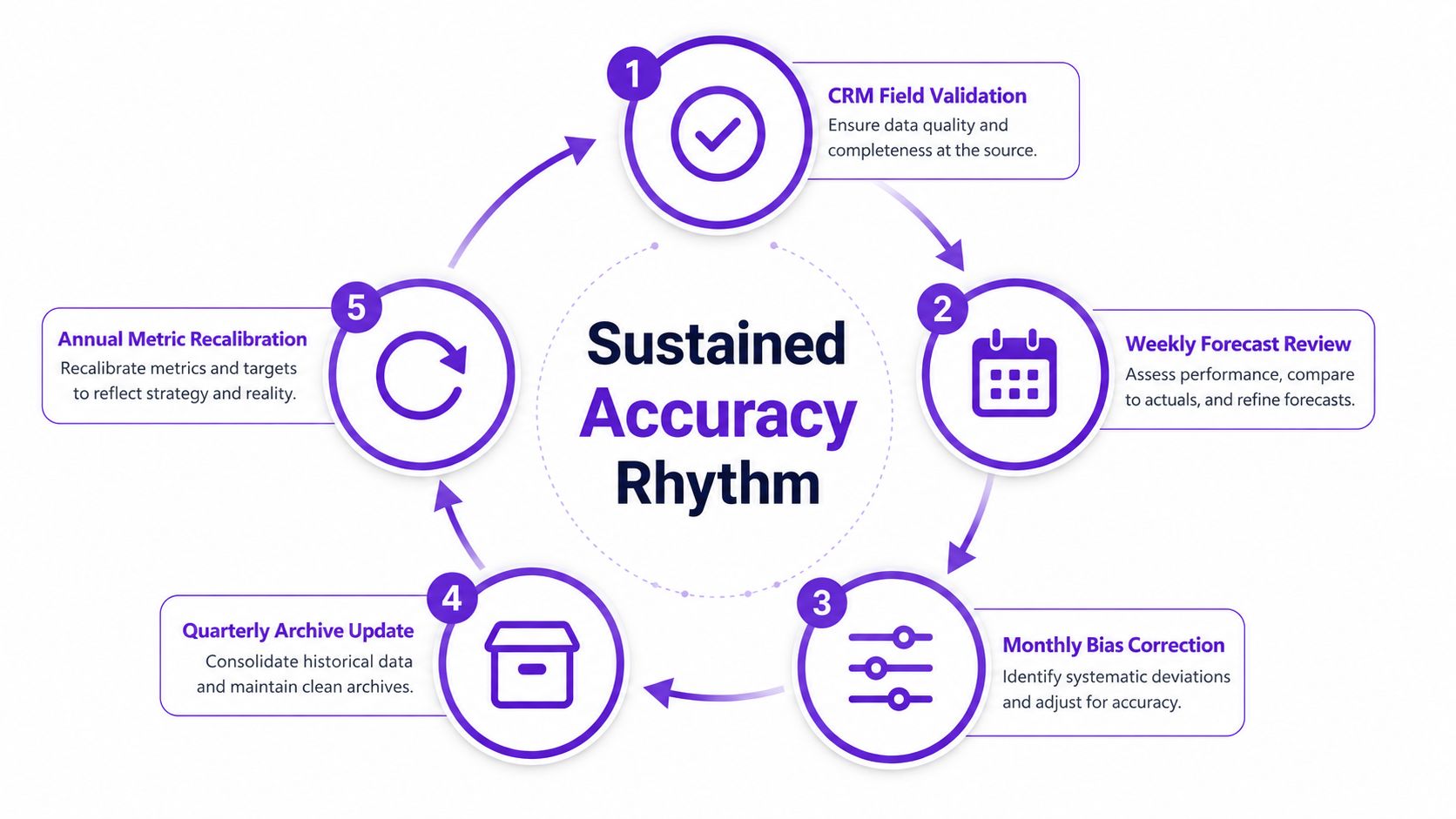
Methods only work if the operating rhythm holds them in place. The boring parts matter here, which is probably why they're so often skipped. CRM field validation, standardized close-date and stage definitions, and a weekly forecast review are not glamorous, but they're the difference between a one-quarter fix and a durable system.
The weekly cadence that keeps the number honest
Run the forecast on a rhythm people can't dodge. Weekly reviews should cover what changed, why it changed, and which deals moved for real reasons versus emotional reasons. Monthly reviews should focus on bias correction, and quarterly reviews should update the archive and the assumptions, not just celebrate or blame.
Validate the CRM fields: if next step, stage, and close date are inconsistent, the forecast is already compromised.
Define category rules: Commit should mean 90%+ probability, Best Case should sit at 60% to 80%, and Pipeline should stay below 60%.
Check coverage: a 3 to 5x pipeline coverage ratio gives room for ordinary slippage.
Coach the call: managers should challenge optimistic inflation, especially where the data says a deal shouldn't be in Commit yet.
Practical rule: when the stage language is sloppy, the forecast becomes a negotiation instead of a prediction.
The judgmental adjustment research matters here because it explains which coaching moves prove effective. Larger corrections tend to improve accuracy more than tiny nudges, and negative adjustments are safer than positive ones. That means managers should be more willing to remove wishful upside than to add it. The useful habit is to ask, “What evidence would make this a lower call?” not “How do we justify keeping it high?”
An archive is the final piece that keeps everyone honest. A forecast history that stores the statistical version, the adjusted version, and the rep version gives you something to compare against later. Without it, nobody remembers where the miss started, and every quarter becomes a fresh argument. The old excuse, “That number was different back then,” gets a lot less persuasive when the whole trail is saved.
Your 90-Day Forecast Accuracy Improvement Plan
The cleanest way to improve forecast accuracy is to make the next 90 days boring on purpose. Start by building the archive and the baseline, because if you don't know where you started, you'll end up arguing about whether things got better. Then clean the data, standardize the forecast language, and let the weekly cadence do its job.
In weeks one to two, assign one owner to the archive and one owner to the baseline audit. Store every forecast version, statistical, adjusted, and salesperson, so actuals can be compared later. The output should be simple, a defensible starting MAPE and bias readout by segment, planner, and horizon.
In weeks three to six, clean the fields that keep breaking the process. Standardize stage definitions, close dates, and category rules, then force those definitions into the weekly review. If the category language is still fuzzy, the rest of the plan will just generate prettier confusion.
By weeks seven to ten, introduce the chosen methods and the signal layer only where they belong. A causal or combined baseline can sit underneath the process, while intent signals help the top segments where buying behavior is visible. Keep the scope tight. Broad experimentation looks energetic and usually just slows the team down.
The last stretch, weeks eleven to twelve, is where manager coaching matters most. Review judgmental adjustments, trim the positive inflation, and compare the adjusted forecast with the baseline in the archive. The board-facing KPI set should be the one the CRO can defend in plain English, MAPE under 15%, bias within plus or minus 5%, and at least 80% of segments reviewed monthly. Those numbers are only useful if the archive makes them honest.

The point of the plan isn't to make the forecast impressive. It's to make it boringly true, over and over, until finance can trust the number without a long meeting about caveats.
If you want a practical way to turn real buying behavior into better pipeline signals, visit RoverLead AI. It helps teams track LinkedIn engagement, surface intent, and refresh scoring with real outcomes, which is exactly the kind of discipline forecast accuracy improves on.